The Power of a Well-Designed Landing Page: How to Boost Your Conversions
In the world of digital marketing, conversion is the holy grail. Whether you’re looking to capture leads, generate sales, or drive event registrations, your landing page is the key to achieving that. But having just any landing page isn’t enough; it needs to be well-designed to maximize its impact and guide the visitor towards the action you desire. In this article, we’ll explain what makes a landing page effective, how you can leverage its design to increase conversions, and why investing in an optimized page is crucial for your digital strategy.
1. What is a Landing Page and Why is it Important?
A landing page is a web page specifically created to convert visitors into leads or actual customers. Unlike other pages on your site, a landing page has a single goal: conversion.
Think of it like a top salesperson in a store. While other pages may distract with multiple options or general information, the landing page focuses solely on getting the user to take the next step: filling out a form, downloading a resource, purchasing a product, or signing up for a service.
Its importance lies in its ability to focus on one action, eliminating distractions and optimizing the user journey.

2. Key Elements of a Well-Designed Landing Page
An effective design isn’t just about aesthetics; it’s about strategy. Here are the essential elements every landing page should include:
a. An Irresistible Headline
The headline is the first thing a visitor will see, and its job is to capture immediate attention. It should be clear, direct, and focus on the main benefit.
For example:
- Bad: “Discover our new marketing course.”
- Good: “Learn how to double your sales in 30 days with our marketing course.”
b. A Clear Value Proposition
Why should the visitor stay? The value proposition answers this question by highlighting the unique benefit they will get. Use bullet points, short phrases, or a subheading to quickly explain what problem you’re solving and how you do it better than anyone else.
c. A Strong Call to Action (CTA)
The action button must be eye-catching, clear, and focused on the benefit. Phrases like “Download Now,” “Get My Discount,” or “Sign Up for Free” work better than just “Submit.”
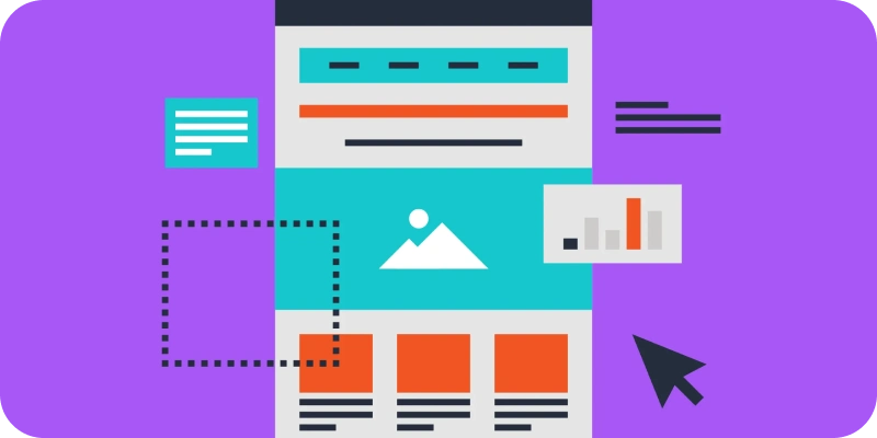
d. Attractive and Clean Visual Design
A cluttered or confusing design will scare visitors away. Keep a minimalist design with colors that guide attention toward the CTA. Use images or videos that reinforce your message but avoid overloading the page.
e. Social Proof and Testimonials
Customer testimonials, success stories, or trust badges build credibility and remove objections. Include brief quotes, customer images (if possible), or statistics that support your claims.
f. Optimized Loading Speed
A landing page that takes more than three seconds to load loses 53% of users. Optimize images, eliminate unnecessary scripts, and prioritize speed.
3. How to Boost Your Conversions with a Landing Page
Boosting your conversions relies on constant data-driven decisions and testing. Here are some practical tips:
a. Focus on a Single Goal
A golden rule: one landing page, one goal. If you try to offer multiple options, you will confuse the user. For example, if your goal is to get them to register for a demo, remove any unnecessary links that could lead them off the page.
b. A/B Test Different Versions
Never settle for the first version of your landing page. Run A/B tests to compare headlines, CTA button colors, layout, or images. Often, small changes can lead to big results.
c. Personalize According to Your Audience
The message and design should cater to your target audience. Who are you trying to convert? Use language that resonates with their needs, desires, and concerns.
d. Use Urgency and Scarcity
Phrases like “Limited time only” or “Last spots available” can prompt users to act faster. However, use this technique honestly and strategically.
4. Common Mistakes to Avoid
Even the best intentions can fail if you fall into these common pitfalls:
- Too much information: Remember, less is more. Every word and element should guide the user toward conversion.
- Long forms: A form with too many fields can be demotivating. Only ask for essential information.
- Not optimizing for mobile: If your landing page isn’t mobile-responsive, you’re losing a significant amount of traffic.
- Not measuring results: Use tools like Google Analytics or Hotjar to track user behavior and make improvements.
5. Why Invest in a Professional Landing Page?
While many tools allow you to quickly create landing pages, a professional design will make a significant difference. A landing page designed by experts is not only aesthetically pleasing but also backed by proven conversion and psychological strategies.
At Floix Agency, we specialize in creating landing pages that not only look good but also perform. We work with you to understand your business, audience, and goals, ensuring that each element is designed to convert.
The design of a landing page may seem like a small detail, but its impact on your conversions is undeniable. A well-designed page combines strategy, psychology, and creativity to turn visits into results.
If you’re ready to maximize your digital marketing potential, start by optimizing your landing page. Contact us at Floix Agency and turn every click into a business opportunity.
Talk to us and take your conversions to the next level.